|
grahame
|
 |
« on: August 08, 2021, 22:03:44 » |
|
I'm seeing new logo ideas on Facebook. The old BR▸ one at Melksham was:  Perhaps this should be the new one:  |
|
|
|
|
 Logged
|
Coffee Shop Admin, Chair of Melksham Rail User Group, TravelWatch SouthWest Board Member
|
|
|
|
CyclingSid
|
 |
« Reply #1 on: August 09, 2021, 07:02:33 » |
|
If it is going to be Great British Railways it presumably needs some blue in it?
|
|
|
|
|
 Logged
|
|
|
|
|
IndustryInsider
|
 |
« Reply #2 on: August 09, 2021, 08:27:07 » |
|
Given that the old BR▸ logo survived all the way through the privatisation years, it will be rather ironic if it changed now we’re moving back towards a more ‘nationalised’ set of arrangements.
|
|
|
|
|
 Logged
|
To view my GWML▸ Electrification cab video 'before and after' video comparison, as well as other videos of the new layout at Reading and 'before and after' comparisons of the Cotswold Line Redoubling scheme, see: http://www.dailymotion.com/user/IndustryInsider/ |
|
|
|
Lee
|
 |
« Reply #3 on: August 09, 2021, 09:21:18 » |
|
Given that the old BR▸ logo survived all the way through the privatisation years, it will be rather ironic if it changed now we’re moving back towards a more ‘nationalised’ set of arrangements.
Didnt the White Paper see the logo as central to what they are trying to acheive, and to only expect the odd "regional variation" ? For my part, I have had my suggested GBR▸ logo on my profile for some time now  |
|
|
|
|
 Logged
|
|
|
|
|
Reading General
|
 |
« Reply #4 on: August 09, 2021, 10:50:39 » |
|
I would vote to stick with the arrows of indecision as it is a universally accepted British symbol however, this particular government probably can’t help themselves to do a massive marketing and rebranding exercise with something probably covered in union flags, bulldogs, lions, a red phone box, a black taxi, the Palace of Westminster, tower bridge and other London based things that the world thinks is British to get across their build better British back better tag line. They would want their own mark on it even if it doesn’t make sense. In an ideal world it needs to be uncomplicated, which the arrows already are.
|
|
|
|
|
 Logged
|
|
|
|
|
Electric train
|
 |
« Reply #5 on: August 09, 2021, 10:57:12 » |
|
I feel it will have a little done to it as a basic logo, there will be National difference applied and possibly Regions having a variant. NR» Regions will become I suspect will be the GBR▸ Regions
|
|
|
|
|
 Logged
|
Starship just experienced what we call a rapid unscheduled disassembly, or a RUD, during ascent,”
|
|
|
|
GBM
|
 |
« Reply #6 on: August 09, 2021, 11:21:20 » |
|
For my part, I have had my suggested GBR▸ logo on my profile for some time now  Does that indicate "Two track Melksham, NOW"  With due apologies from the originator for perhaps misuse and abuse of their original demand |
|
|
|
|
 Logged
|
Personal opinion only. Writings not representative of any union, collective, management or employer. (Think that absolves me...........)  |
|
|
|
grahame
|
 |
« Reply #7 on: September 22, 2021, 07:36:06 » |
|
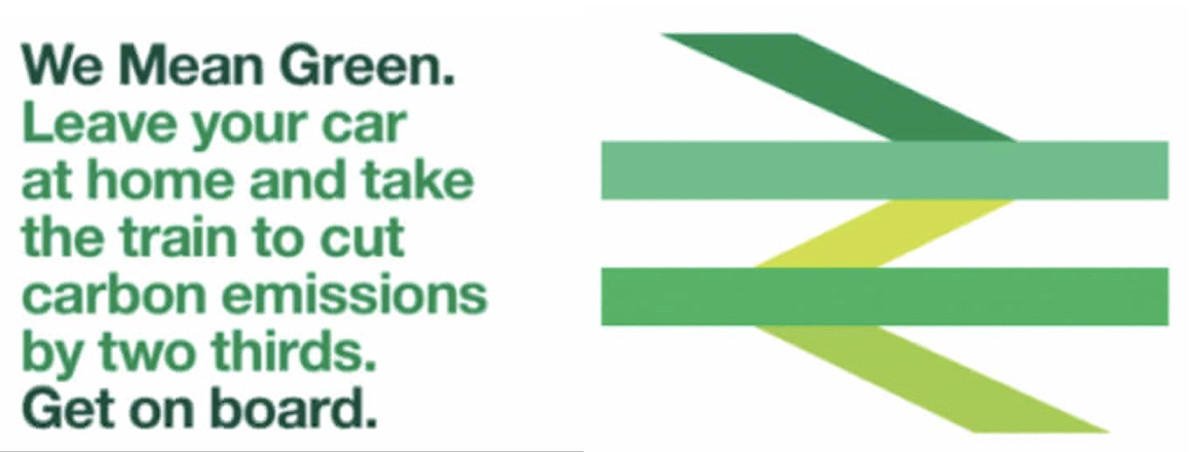
From The GuardianBritish Rail logo designer appalled by green makeover ‘mess’The designer of the familiar British Rail logo has warned against government plans to revamp the symbol and dismissed an attempt to give it a green makeover as a “load of old bollocks”.  The green makeover of British Rail’s double-arrow logo. Photograph: Rail Delivery Group |
|
|
|
|
 Logged
|
Coffee Shop Admin, Chair of Melksham Rail User Group, TravelWatch SouthWest Board Member
|
|
|
|
Lee
|
 |
« Reply #8 on: September 22, 2021, 09:29:32 » |
|
From The GuardianBritish Rail logo designer appalled by green makeover ‘mess’The designer of the familiar British Rail logo has warned against government plans to revamp the symbol and dismissed an attempt to give it a green makeover as a “load of old bollocks”.  The green makeover of British Rail’s double-arrow logo. Photograph: Rail Delivery Group Now Barney is worried his logo could be used to conceal the failings of a rebranded privatised system Perish the thought, eh?  |
|
|
|
|
 Logged
|
|
|
|
|
Bob_Blakey
|
 |
« Reply #9 on: September 22, 2021, 09:48:12 » |
|
And of course we the taxpayers would be on the hook for financing the replacement of what must be the thousands of signs which carry the original, instantly recognised, design.
WALOB indeed.
If it ain't broke don't try and fix it.
|
|
|
|
|
 Logged
|
|
|
|
|
Witham Bobby
|
 |
« Reply #10 on: September 22, 2021, 11:04:45 » |
|
This has to be fake news, surely?
Take one of the most instantly recognisable corporate logos and trash it. And while you're at it, insult the majority of people who don't need a message that rail travel produces less CO2 per passenger mile travelled than car travel; they already know it
|
|
|
|
|
 Logged
|
|
|
|
|
Bmblbzzz
|
 |
« Reply #11 on: September 22, 2021, 12:10:21 » |
|
If it's a variant to be used for a specific advertising campaign, fair enough. If it's meant to be a permanent logo for all situations, it's not good. Too many shades, not bold and cohesive enough. If they really feel a new logo is needed (but at the same time should be based on the original; hmm... ) then at least make it something instantly identifiable against various backgrounds, lighting conditions and so on.
|
|
|
|
|
 Logged
|
Waiting at Pilning for the midnight sleeper to Prague.
|
|
|
Red Squirrel
Administrator
Hero Member
    
Posts: 5502
There are some who call me... Tim

|
 |
« Reply #12 on: September 22, 2021, 12:11:48 » |
|
This has to be fake news, surely?
Take one of the most instantly recognisable corporate logos and trash it. And while you're at it, insult the majority of people who don't need a message that rail travel produces less CO2 per passenger mile travelled than car travel; they already know it
I think the Guardian is manufacturing outrage here. Shapps says they want to update the logo, and the RDG▸ have produced a version for their 'We Mean Green' campaign (see here: https://www.youtube.com/watch?v=ml2l8DXZNvc). I can't see anything in the story to suggest that this four-colour version is to replace the familiar red and white version. It is probably a measure of how good Gerry Barney's original logo is that it can be adapted for campaigns without losing its brand recognition. But as others have said, the BR▸ logo is not bust and does not need fixing. We have far better things to spent the money on! |
|
|
|
|
 Logged
|
Things take longer to happen than you think they will, and then they happen faster than you thought they could.
|
|
|
|
stuving
|
 |
« Reply #13 on: September 22, 2021, 12:25:20 » |
|
To be fair to the Guardian, they didn't really fake the news themselves - they put the bits next to each other and let people jump to the wrong conclusion for themselves. It's an old journalistic trick, and it obviously still works, given how many people (not just here) fell into the trap. The original Williams Shapps quote is: Great British Railways will use updated versions of the classic ‘double arrow’ logo as well as the Rail Alphabet typeface, used in this document. Even after 25 years of privatisation, the logo remains the most widely-used and best-recognised symbol of the railways. It is the standard marker on road signs. It appears on most tickets, online, and at the vast majority of stations. It will stay in those places and increasingly appear on trains, uniforms and publicity material too as and when these are upgraded or replaced as a single, unifying brand for the railways. Keeping it also avoids spending money on yet another new railway logo. So "updated versions", based on that, means updated to be used on new media, as well as new purposes such as this "green" campaign. Of course that does not rule out some GBR▸ marketing types getting carried away in the future. |
|
|
|
|
 Logged
|
|
|
|
|
broadgage
|
 |
« Reply #14 on: September 22, 2021, 18:38:07 » |
|
If it's a variant to be used for a specific advertising campaign, fair enough. If it's meant to be a permanent logo for all situations, it's not good. Too many shades, not bold and cohesive enough. If they really feel a new logo is needed (but at the same time should be based on the original; hmm... ) then at least make it something instantly identifiable against various backgrounds, lighting conditions and so on.
I agree, the green logo is fine for a specific advertising or promotional purpose. But the standard logo should remain as is, it remains widely used and understood and should not be updated or modified in any way. Long after the demise of "British rail" it was used to denote national rail services, especially when it was required to distinguish these from say LUL▸ , TFL▸ , or heritage rail operations. |
|
|
|
|
 Logged
|
A proper intercity train has a minimum of 8 coaches, gangwayed throughout, with first at one end, and a full sized buffet car between first and standard.
It has space for cycles, surfboards,luggage etc.
A 5 car DMU▸ is not a proper inter-city train. The 5+5 and 9 car DMUs are almost as bad.
|
|
|
|


