|
grahame
|
 |
« on: August 12, 2017, 22:10:45 » |
|
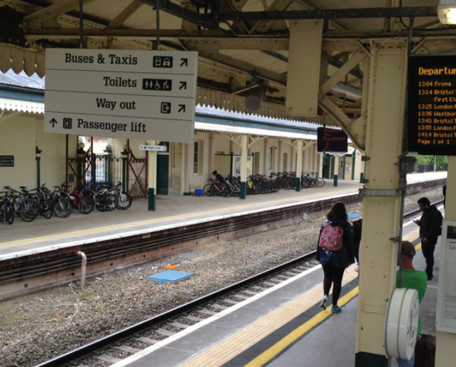
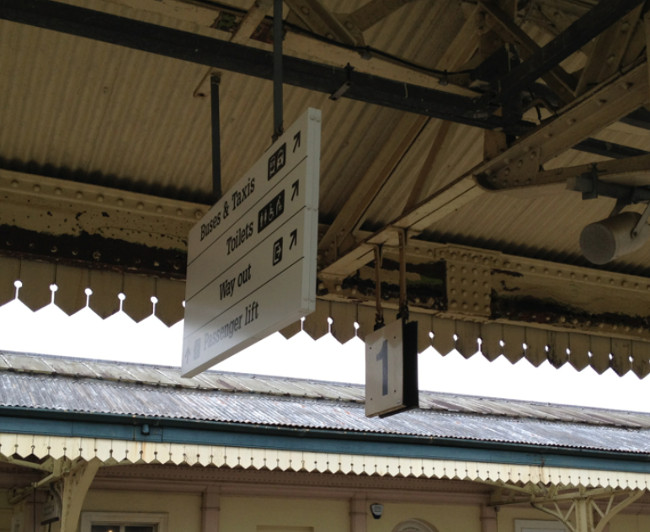
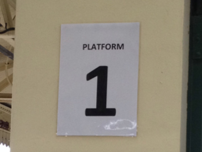
If you want a new sign to be seen ... you put it prominently in front of the existing signage .... Coming down the steps to the platform in Chippenham:  Hiding the unimportant old signage like the platform numbers:  Thank goodness for A4 printers and laminators - an excellent local solution:  Problem shouldn't have needed to be sorted in the first place if the new signage had been properly designed! Problem shouldn't have needed to be sorted in the first place if the new signage had been properly designed! |
|
|
|
|
 Logged
|
Coffee Shop Admin, Chair of Melksham Rail User Group, TravelWatch SouthWest Board Member
|
|
|
|
Worcester_Passenger
|
 |
« Reply #1 on: August 13, 2017, 00:33:11 » |
|
Here are the East Midlands platforms at St Pancras on the first day of the Eurostar services back in 2007. The rebuilding of the station cost £800 million.
Notice (1) the architect-desgned platform numbers that are integrated with the barriers and (alas) have people standing in front of them, and (2) the cheapy-printed and laminated numbers which have been attached to the overhead lighting.
|
|
|
|
|
 Logged
|
|
|
|
|
stuving
|
 |
« Reply #2 on: August 13, 2017, 10:02:43 » |
|
If you want a new sign to be seen ... you put it prominently in front of the existing signage .... Coming down the steps to the platform in Chippenham:  That's not the typeface we are used to seeing on stations, is it? BR▸ signs were in Rail Alphabet, and Network Rail use Brunel - which is very similar. So is this part of the (now not so) new GWR▸ branding? Well, actually it is. At the tiime, the design consultants Pentagram said: The typeface, Glypha, has been chosen for its legibility, ideal for delivering the often complex information required in the transport industry.
The new branding has now been applied across several elements of the network, from rolling stock and ticket offices, to uniforms, timetables, a new-look website (created by ORM) and mobile app. The identity will be implemented across the whole fleet of GWR trains and stations. So I reckon that is Glypha Black. But chosen for its legibility? I beg to differ; I think it is cramped and hard to read, even slowly. The original Rail Alphabet was adapted from their Transport typeface by Calvert and Kinneir. Transport was for motorway signs, and explicitly designed to be read in a fraction of a second. Rail Alphabet was intended to be a little friendlier - less stark - but still very clear. Brunel was introduced by Railtrack, and kept by NR» , as a still cuddlier variant on the same sans serif base. In 2009 it was proposed as a network-wide standard, but not mandated by DfT» , though SWT▸ (and others) have adopted it. Which is where it becomes a bit odd, as station signs are very much long-term items; you would not want to change them all at a franchise change. So, since the GWR branding was in part an unbranding - taking First's name off so a new franchisee could own the branding - why are GWR/First making such a dramatic "look at me I'm different" statement here? And, come to that, why in Chippenham? |
|
|
|
|
 Logged
|
|
|
|
|
grahame
|
 |
« Reply #3 on: August 13, 2017, 10:34:38 » |
|
So I reckon that is Glypha Black. But chosen for its legibility? I beg to differ; I think it is cramped and hard to read, even slowly.
Don't know "why Chippenham". Probably timing / at the point the bridge that used to take the public footpath across the station was being replaced with one with steps down to the platform and lifts on two out of the three staircases. Here is some text in Glypha 75 ... not sure what the "75" means. I too did a double take hen I first saw it, but I've now got used to it. Frankly, I think it looks old fashioned - but then the new GWR▸ look's supposed to restore the glory of GWR from the old days, and elements of that will be the historic look, won't they? |
|
|
|
|
 Logged
|
Coffee Shop Admin, Chair of Melksham Rail User Group, TravelWatch SouthWest Board Member
|
|
|
|
stuving
|
 |
« Reply #4 on: August 13, 2017, 10:53:27 » |
|
Here is some text in Glypha 75 ... not sure what the "75" means. I too did a double take hen I first saw it, but I've now got used to it. Frankly, I think it looks old fashioned - but then the new GWR▸ look's supposed to restore the glory of GWR from the old days, and elements of that will be the historic look, won't they? I think the '75' indicates weight, and in this case means the same as "black" - i.e. bolder than bold. But I'm not a typographer; mind you I don't think Pentagram are either. It dates from the 70s, and I think it looks dated in that sense: the one you'd expect a design consultant to use. But it doesn't look "heritage" enough to match GWR in the sense you mean, not to me anyway. And I don't think First ever wanted to create more than a superficial hint by using the GWR name and perhaps a more heritage-like colour scheme (though anything would have met that requirement compared with Dynamic Lines). I do recognise it (in lighter weights) from the printed timetables etc., but if you look closely at one you'll see they use it there only for headings and titles. Body text is in a plainer sans serif face, as are the timetables and notes symbols. In other words, everything where reading the details matters doesn't use Glypha. Maybe, being design consultants, Pentagram reason that signs are done in big letters so are a kind of heading or title? Which ignores the fact that they are big so that people with poor eyesight can read them from far off! |
|
|
|
« Last Edit: August 13, 2017, 14:09:36 by stuving »
|
 Logged
|
|
|
|
|
Bmblbzzz
|
 |
« Reply #5 on: August 13, 2017, 13:17:26 » |
|
I've definitely seen that typeface in other GWR▸ contexts though I can't think exactly where right now. Possibly only timetables though I did think I'd seen it on stations too (and I haven't been to Chippenham recently). I rather like it though I agree it's less instantly legible than the previous sans serif font.
|
|
|
|
|
 Logged
|
Waiting at Pilning for the midnight sleeper to Prague.
|
|
|
|
bobm
|
 |
« Reply #6 on: August 13, 2017, 16:04:41 » |
|
It is at quite a few in the West Country, Tiverton Parkway springs to mind as well as the new signage at Newton Abbot in connection with the recently installed gateline. I think Chippenham was among the first however.
|
|
|
|
|
 Logged
|
|
|
|
|
grahame
|
 |
« Reply #7 on: August 13, 2017, 16:45:22 » |
|
.... the new signage at Newton Abbot ....
Yeah - that's interesting; Chippenham has mixed signage of multiple era and in multiple fonts now - hardly the complete "culture transformation" that's on Diane Burke's public LinkedIn page. |
|
|
|
|
 Logged
|
Coffee Shop Admin, Chair of Melksham Rail User Group, TravelWatch SouthWest Board Member
|
|
|
|
SandTEngineer
|
 |
« Reply #8 on: August 14, 2017, 08:04:58 » |
|
Why not just stick to the 'Rail Alphabet'. One of the best designs ever, and I have never had any trouble reading it over 50 odd years....  |
|
|
|
|
 Logged
|
|
|
|
|
CyclingSid
|
 |
« Reply #9 on: August 14, 2017, 09:01:33 » |
|
For those unsure about the meaning of Glypha 75, a demonstration of the differences can be found at: https://www.fonts.com/font/linotype/glyphaI think the use of numbers to indicate weight and style started with Univers. It is now fairly commonly used, as being more necessary with digital fonts compared with the smaller range that used to be available in metal fonts. Some typographers still believe that serif fonts (such as Glypha 75) are less readable for signage than san-serif fonts (such as Transport). But there again a design consultancy (not necessarily typographers) have to have something visible for the probably not inconsiderable sum of money they will have charged. |
|
|
|
|
 Logged
|
|
|
|
|
JayMac
|
 |
« Reply #10 on: August 14, 2017, 09:30:01 » |
|
And that's the rub. A waste of money. Railway Alphabet, or its natural successor NR» Brunel, do the job just fine. But, like a dog territorially pissing, TOCs▸ just have to mark themselves out. Until the next one comes along... I suppose we'll see First/MTR change all the excellent NR Brunel signage across South Western land too. Signage that is only around 7 years old.  |
|
|
|
|
 Logged
|
"A clear conscience laughs at a false accusation."
"Treat everyone the same until you find out they're an idiot."
"Moral indignation is a technique used to endow the idiot with dignity."
|
|
|
|
Timmer
|
 |
« Reply #11 on: August 14, 2017, 09:35:06 » |
|
And that's the rub. A waste of money. Railway Alphabet, or its natural successor NR» Brunel, do the job just fine. But, like a dog territorially pissing, TOCs▸ just have to mark themselves out. Until the next one comes along... I suppose we'll see First/MTR change all the excellent NR Brunel signage across South Western land too. Signage that is only around 7 years old.  Maybe the management of GWR▸ know something we don't that they will when the next franchise when it's up for tender  I'll get my coat. On a serious note, would it not make sense for the new franchisee to keep the GWR name and look going forward or is that just not the done thing? |
|
|
|
|
 Logged
|
|
|
|
|
stuving
|
 |
« Reply #12 on: August 14, 2017, 10:01:06 » |
|
Maybe the management of GWR▸ know something we don't that they will when the next franchise when it's up for tender  I'll get my coat. On a serious note, would it not make sense for the new franchisee to keep the GWR name and look going forward or is that just not the done thing? The branding was explicitly an unbranding as far the the First name was concerned - to enable the restyling intended to accompany the upgrade programme to be done during this short "franchise". The timing was a bit out, though, and the delay to the volts on the line has made that worse. As we have discussed before, that unbranding is linked to the franchise provision saying that brand and company names need to be removed before handover or else the new franchisee can claim the cost of that off the old one. The terms of that are a bit wider, though, as it says: Branding
2.2 Subject to any applicable obligations or restrictions on the Franchisee (including the terms of the Rolling Stock Leases), the Franchisee may apply registered or unregistered trademarks (including company names, livery and other distinctive get-up) to any assets owned or used by it in the operation and provision of the Franchise Services.
(a) Subject to paragraphs 2.2(c) and 2.2(g), the Franchisee may:
[ grant a license to use the branding ]
(c) Subject to paragraph 2.2(g), to the extent that:
(i) the Franchisee does not provide a relevant undertaking or licence in accordance with paragraph 2.2(a);
(ii) the Secretary of State considers the relevant Marks to be so distinctive or otherwise such that a Successor Operator could not reasonably be asked to use the relevant assets to which the Marks are applied; or So there is a risk that applying any "distinctive get-up" that the successor can't use would lead to a bill to replace it. In this instance the case might be that the lettering is unfit for purpose and only used in GWR stations, and the SoS has to be convinced of that - which I can't see the current one being. But it's a thought. Certainly a "distinctive get-up" is what Pentagram were aiming to provide. |
|
|
|
|
 Logged
|
|
|
|
|
CyclingSid
|
 |
« Reply #13 on: August 14, 2017, 15:19:13 » |
|
From comments on other threads, I can imagine some passengers (if they had a voice) might prefer the money spent on deep cleaning or train maintenance.
|
|
|
|
|
 Logged
|
|
|
|
|
IndustryInsider
|
 |
« Reply #14 on: August 14, 2017, 15:39:56 » |
|
From comments on other threads, I can imagine some passengers (if they had a voice) might prefer the money spent on deep cleaning or train maintenance.
It's a sign of the times...  |
|
|
|
|
 Logged
|
To view my GWML▸ Electrification cab video 'before and after' video comparison, as well as other videos of the new layout at Reading and 'before and after' comparisons of the Cotswold Line Redoubling scheme, see: http://www.dailymotion.com/user/IndustryInsider/ |
|
|
|

